What to Expect Fact Sheet

Client
Internal Project
Made With
Adobe Illustrator and exported to Adobe Acrobat (PDF)
Time in Development
8 hours
Collaborators
Solo-Project
Background
This assignment required that I design a piece of printable learning material which incorporates color, typography and other graphical elements. The challenge was to utilize my design skills and create something nice enough to show in my portfolio. As a professional designer this task was super fun for me but I needed to make sure not to over think it.
Solution Development
The criteria for this project was creating a visual aid, job aid or guide. The finished piece must be in a format that is printable. It must also be suitable for placement in my public portfolio. I was given the option to use a layout template but chose instead to use my own design which I created using Adobe Illustrator.
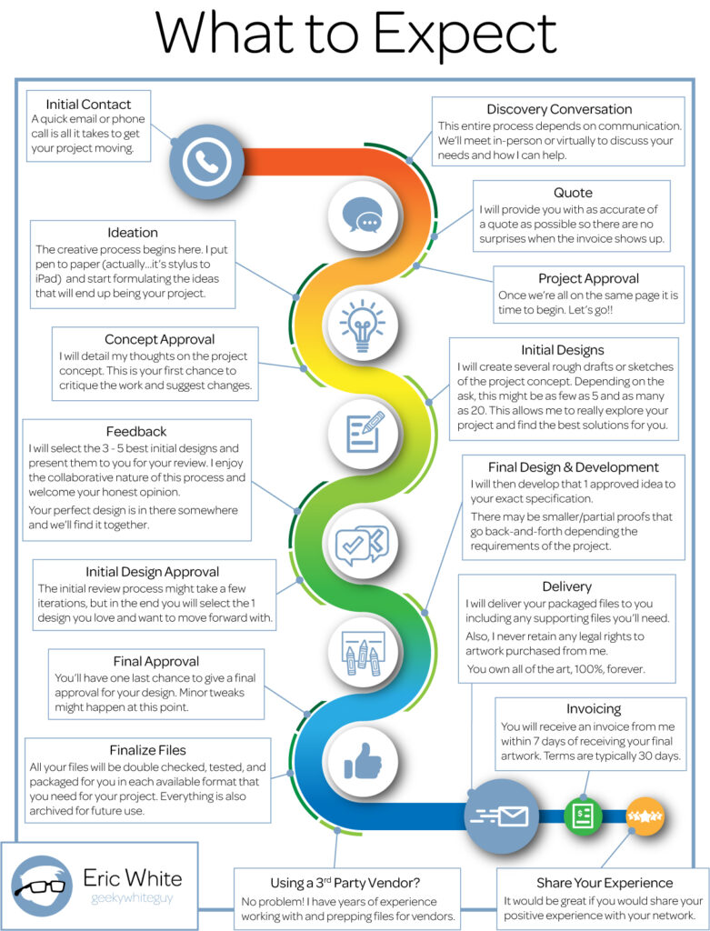
I created a full color, letter sized fact sheet which describes the process that someone who is hiring as me a freelancer to create an illustration or a graphic design piece can expect.
There were a few suggestions provided in the assignment for where to begin with this project and I chose to detail how I work in the form of a process map. I often receive questions about my workflow and what steps are involved in having a design created. I don’t think my process is too much different than many other freelancers, but is a workflow that I have developed for myself over the past 24 years of work.
My process for creating this design was very similar to the process shown on the completed process map. I began by looking on line at many other process map to drum up some inspiration. Next got to work brainstorming several idea by sketching them out. These sketches were very rough but they gave me a good idea of what I would end up really liking, and what probably wouldn’t work. I opted to move forward with a simple milestone slalom. After I had a rough idea of the text, I created the icons, slalom path, and added the copy to the page. Finally, it was just a matter of positioning and editing the text to fit within the space available to me.
This design is built with the intention of being printed on a digital printer, NOT on a CMYK offset press. First, I know that I will not be printing very many of these so offset printing would not be cost effective for me. Also, I wanted the rainbow of colors used on the slalom path to be extremely vibrant, so the art is built in the RGB color space which has a much wider gamut of colors as opposed to the CMYK colors space which would have resulted in a desaturated, somewhat muddy version of the colors I want.
Results
The finished Process Map turned out great. It will be a piece that I print and bring with me when I attend trade shows or get an artists table at a convention or show. This will pay off for me big time in the end. I am a process nerd, so these types of exercises are a lot of fun for me. They force me to take a hard look at the work I do and at what things I do that might be cut out, trimmed down or even expanded upon. For instance, I used to do all my sketching and brainstorming on paper. I have (or had) stacks of sketch books which were filled with doodles and client sketches. After looking into my process I decided that I could trim that process down significantly by creating those sketch digitally. It is much faster and I don’t have all that extra paper sitting around anymore.
I’m pretty sure I’m going to sent this around to some of my graphic designer friends to get their feedback on the content. I think a few critiques will really improve it.